
Meet the Product
EyeGIFs is a small start-up aimed at bettering patient education in the ophthalmic field through a revolutionary web, mobile, and desktop app.
The company needed a new design for their web presence to improve understanding of the product by potential customers. This new design will be live soon.
The Problem
The current website for EyeGIFs does a tremendous job at outlining the depth of the product. This is great for those potential customers who already know what patient education does for them. But for those new to patient education, they lack the understanding of how to use the product to advance their practice. It is believed that this was leading to a drop-off in final subscription conversion.

The Solution
The goal was to build - using copy and layout - a better story for EyeGIFs. This needed to both explain the product, but most importantly, sell potential customers on how to use EyeGIFs in their practice to increase their patients’ satisfaction.
Product images, which showed better ad conversion, were brought up higher onto the website to entice visitors. A tiled storyboard was then added for the three main ways in which the product can be used. This then culminated in delivering the message that EyeGIFs saves you both time and money.
Testing the Message
While redesigning the EyeGIFs website, a series of Facebook ads were designed to rapidly test new messaging. This allowed for a quick turnaround and the narrowing down of messaging that worked on the final website design.

The Finished Design

To begin, carousel images of the product were added to the main tile. A color palette was chosen more-inline with the medical field, and to highlight important CTAs.

A story for the product was formulated such that the EyeGIFs app gives back more time and money through a suite of features.

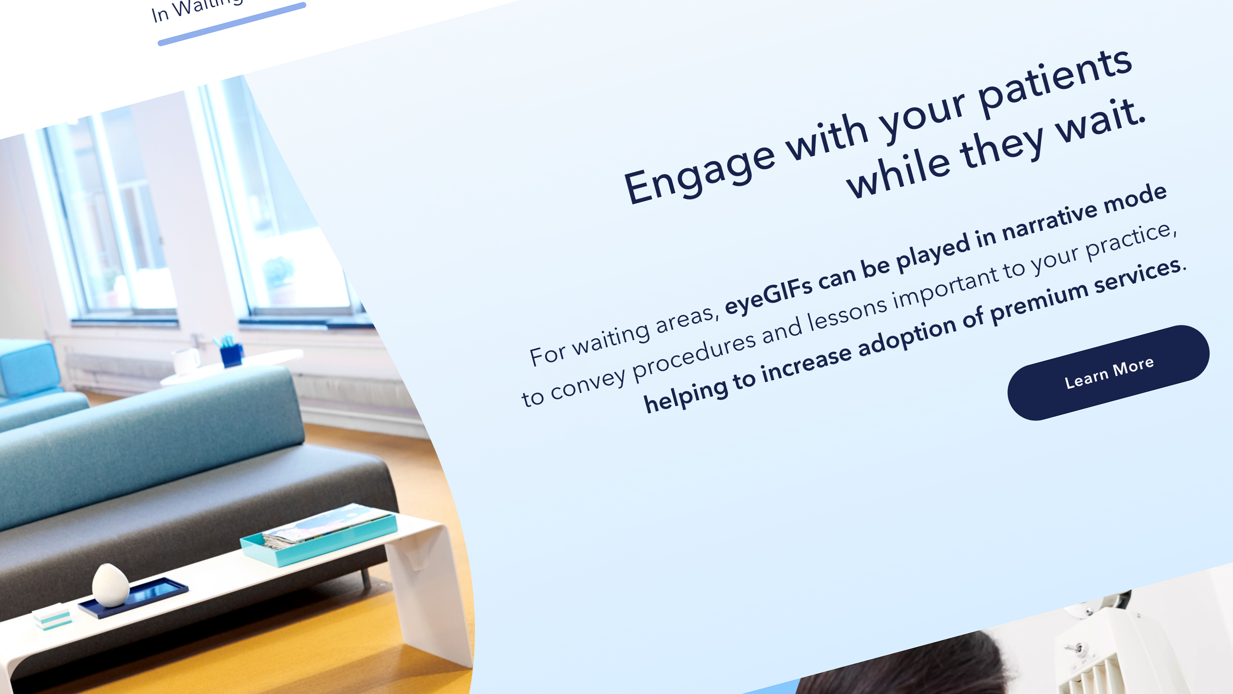
These product features are broken down into three areas: in the waiting room, with the patient, and after the patient has left.

More images of the product were added to excite potential customers. A carousel of product features was also added.